Onfido
Overview
Onfido is a global leader in digital identity verification, helping businesses confirm a user’s identity quickly and securely. I worked with the brand to bring clarity and consistency to a wide range of creative outputs, from pitch decks to iconography, reports and regulatory content. The goal across all pieces was the same: make complex information feel simple, trustworthy and distinctly Onfido.
The company operates in a landscape where accuracy, compliance and user experience must work in perfect sync. With multiple teams producing materials across different regions, Onfido needed a more unified visual language. My role was to refine and strengthen that ecosystem, creating assets that felt aligned, confident and reflective of the brand’s values around trust, accessibility and transparency.
Context
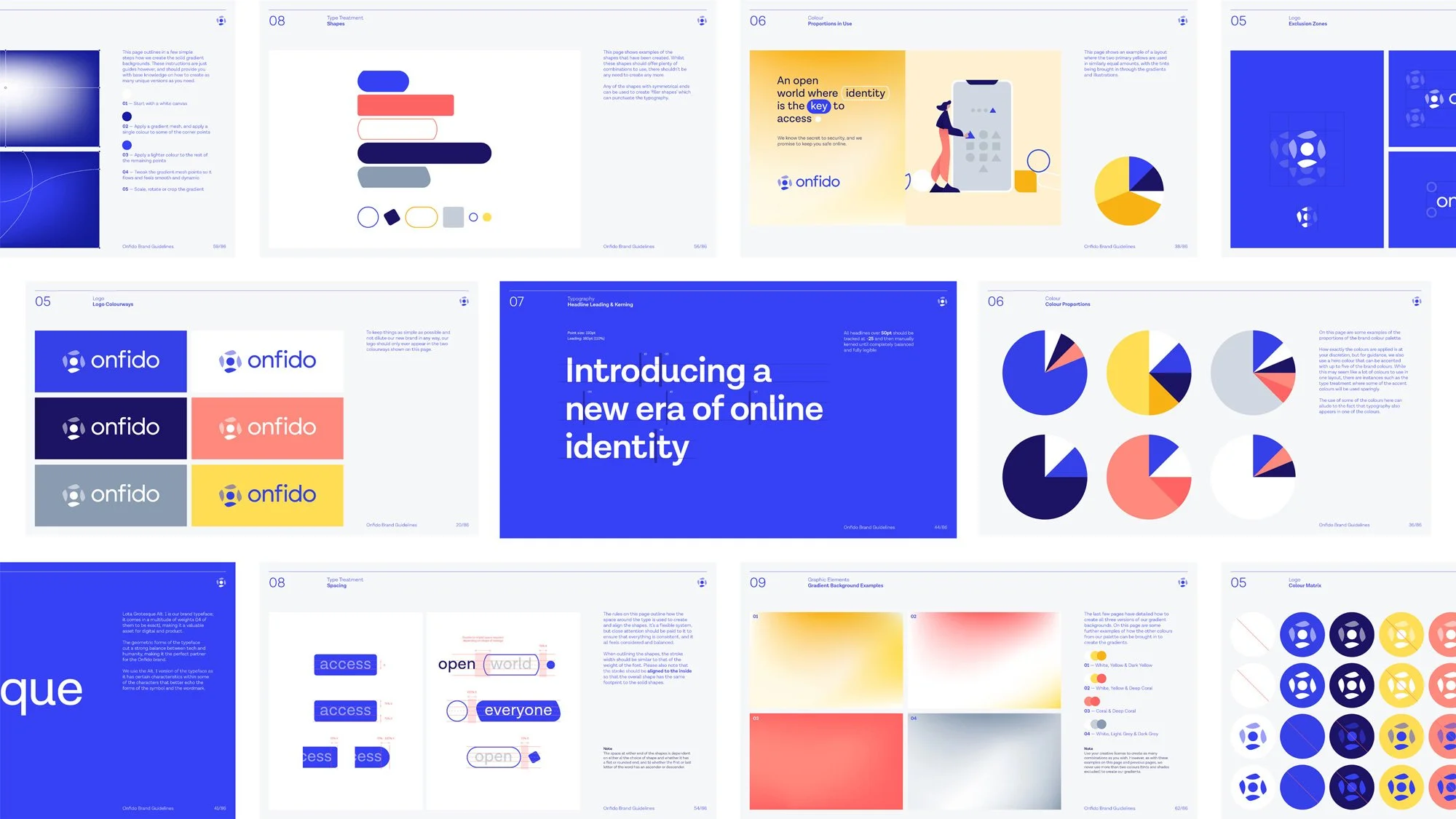
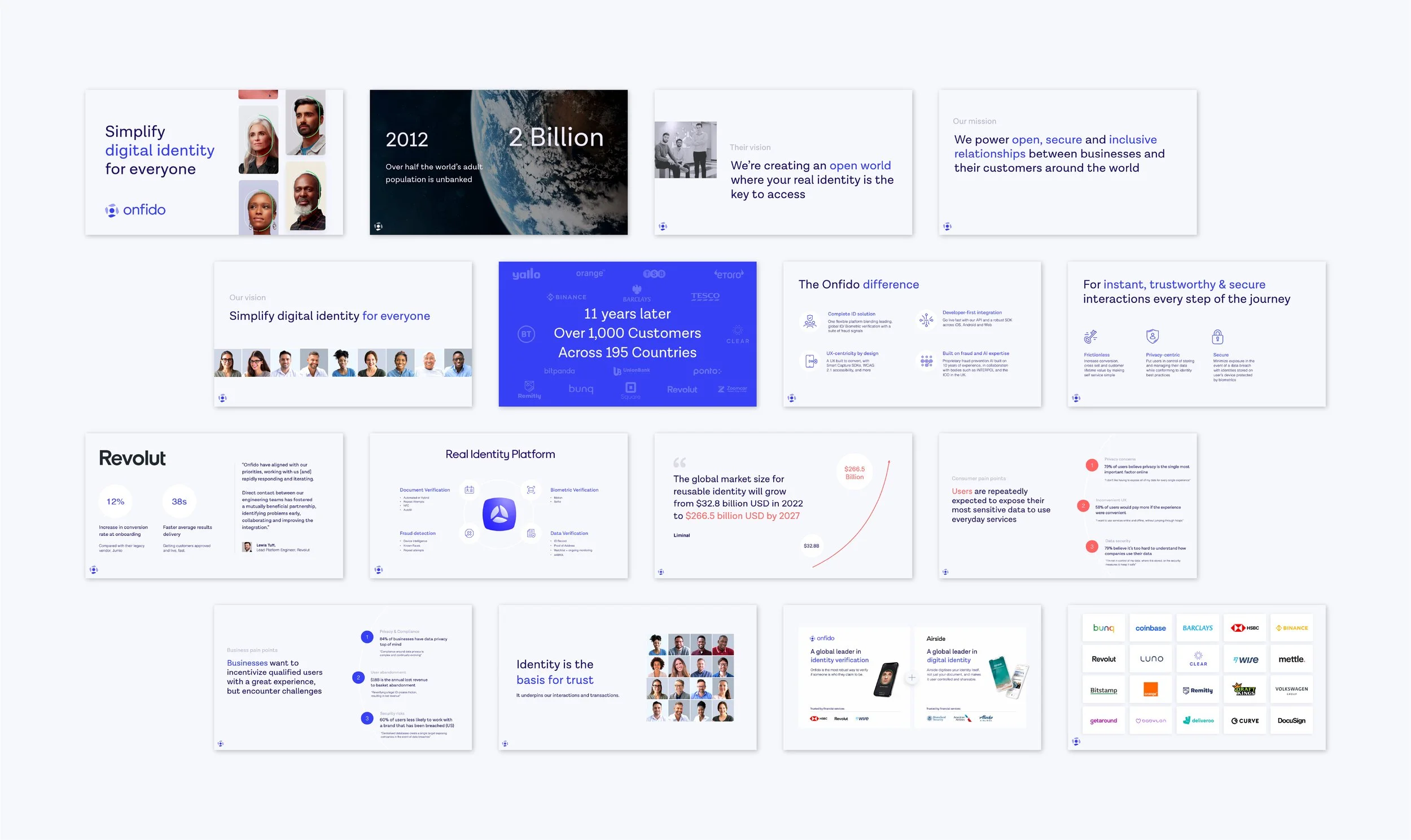
I redesigned several of Onfido’s decks to elevate clarity and storytelling. This involved refining layouts, simplifying dense content and establishing a visual rhythm that helped teams communicate more effectively. The updated structure prioritised hierarchy, readability and visual breathing room, ensuring that even complex verification flows or product explanations were easy to follow and consistently on brand.
Decks
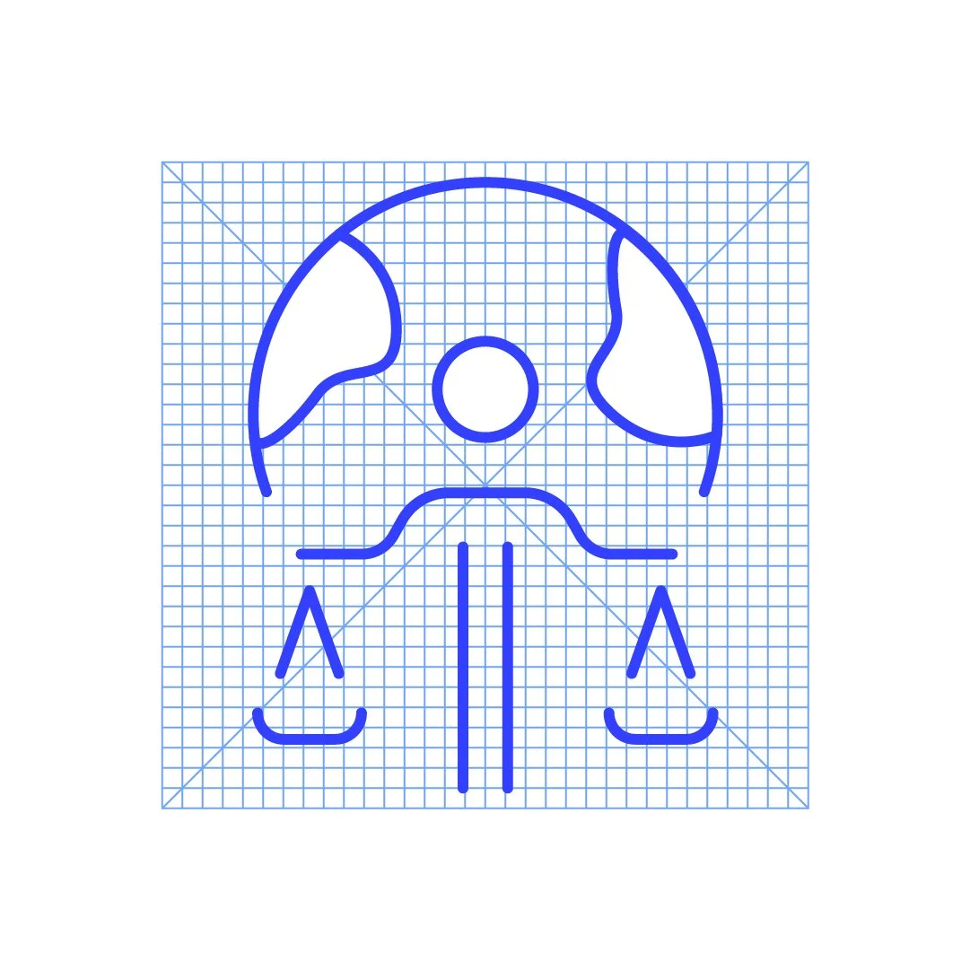
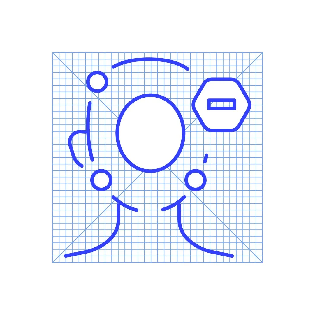
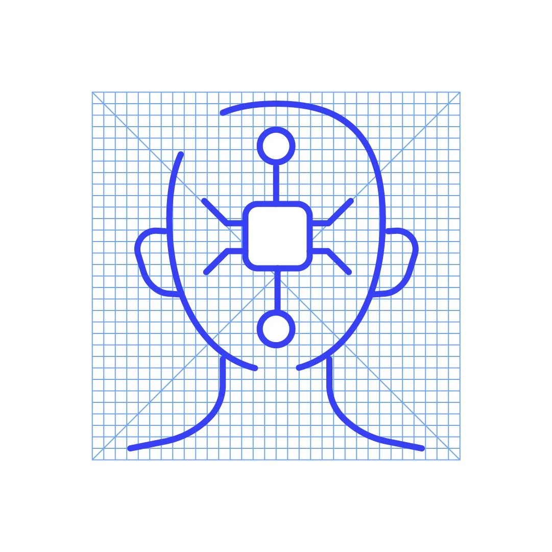
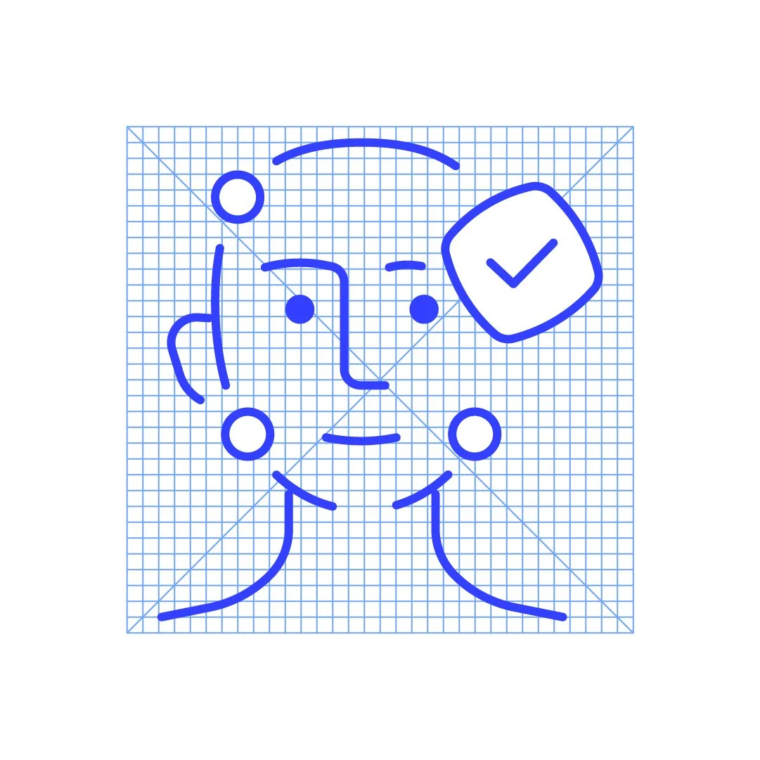
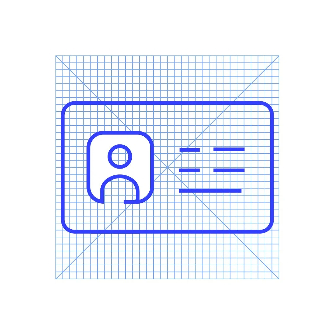
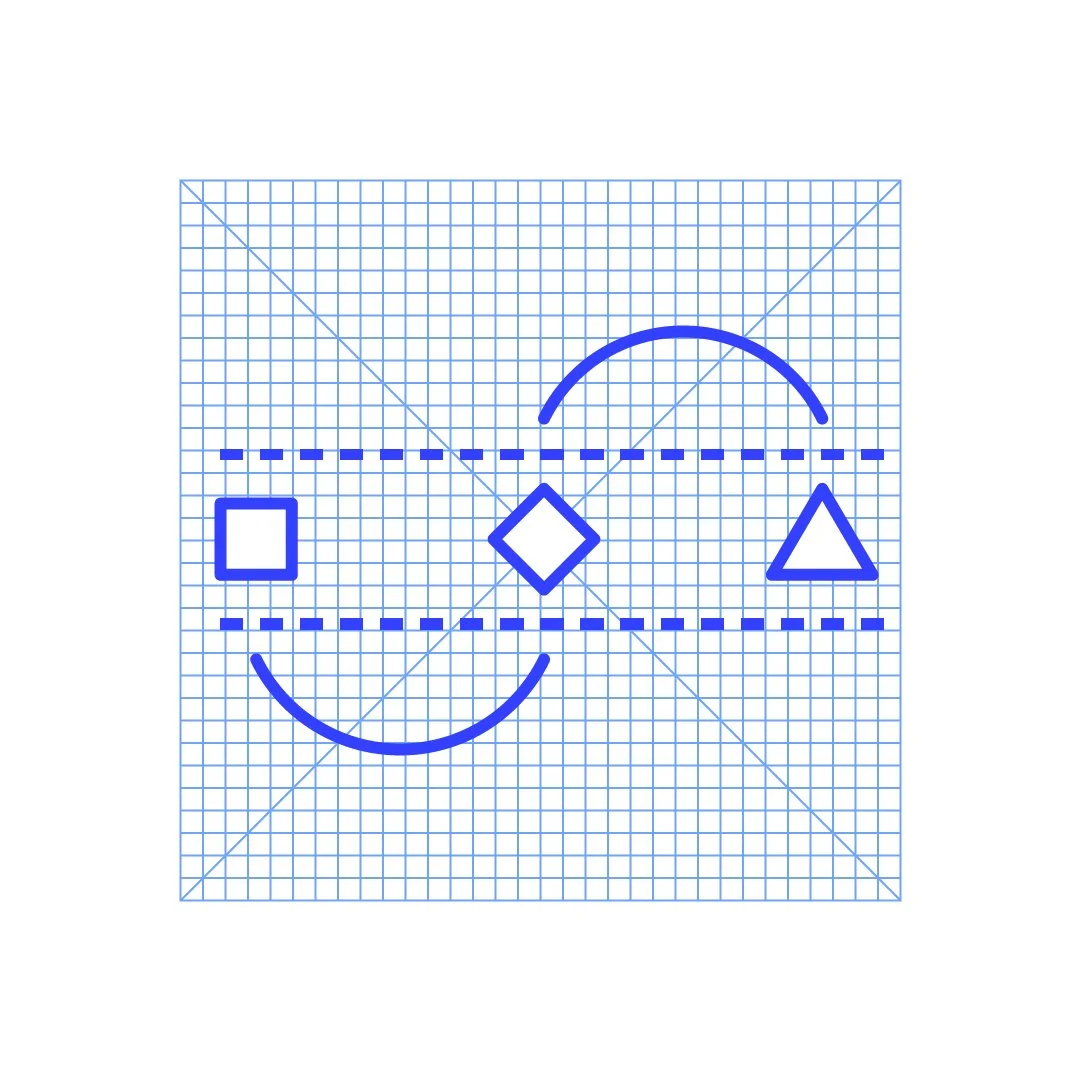
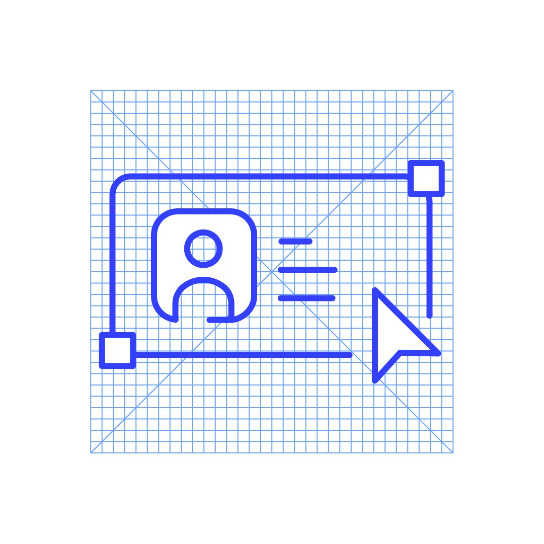
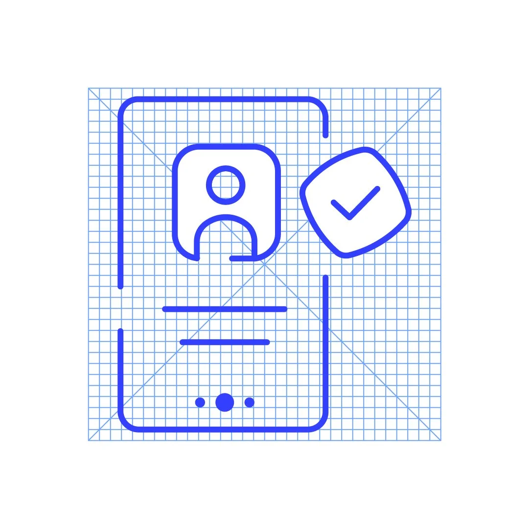
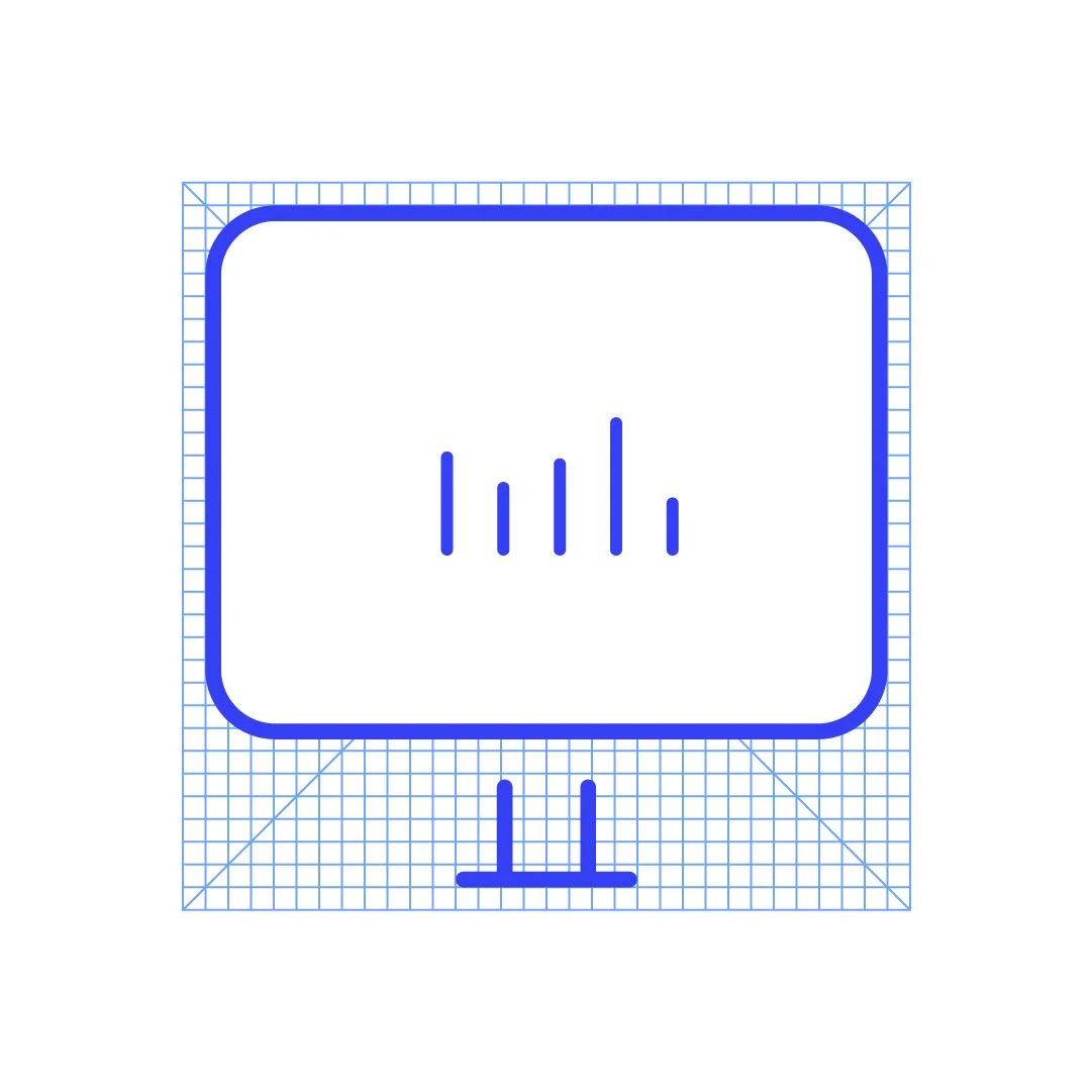
As part of the system, I created a suite of bespoke icons to support both product and marketing teams. Each icon was built to be clean, scalable and instantly readable, balancing technical precision with a human-friendly feel. They formed a modular library that brought coherence to presentations, web content and documentation, making Onfido’s information architecture more intuitive across touchpoints.
Icons

Identity compliance and regulation
Decline user
Missing info
Fraud

Biometric verification
Fraud detection

Synthetic ID
Injection attacks
Evolving fraud
Digital temparing
eID Verification
Identity proofing


Data verification
Document Verification

API Support
API Support
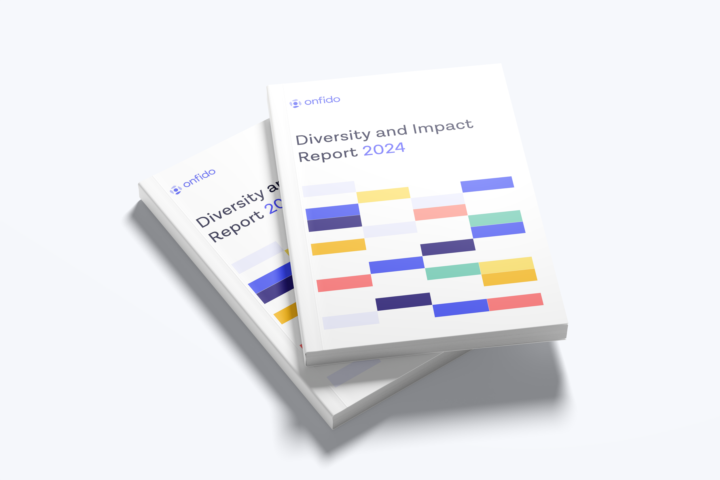
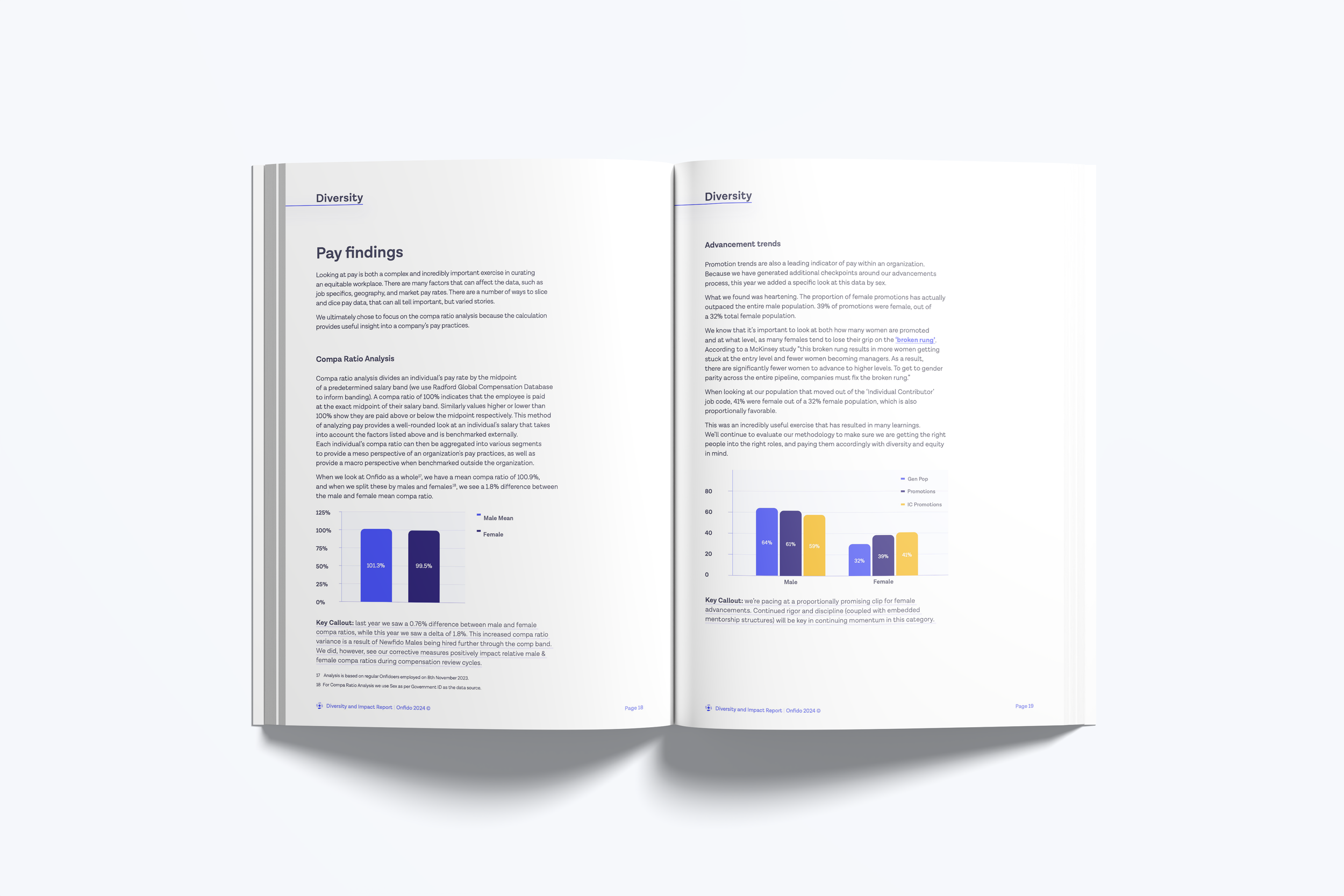
I designed the 2024 Diversity and Impact Report using a visual language that combined Onfido’s clean, structured brand system with inspiration taken from nautical signal flags. The geometric shapes, bold colour blocks and coded visual rhythm of maritime flags became a subtle reference point, giving the report a sense of structure, communication and direction. This approach created a balance between clarity and personality, allowing data and insights to come through confidently while adding a graphic style that felt distinctive and uplifting. The final outcome was a report that looked polished and modern while reflecting the diversity, transparency and forward-looking culture within Onfido.
Diversity and Impact Report 2024
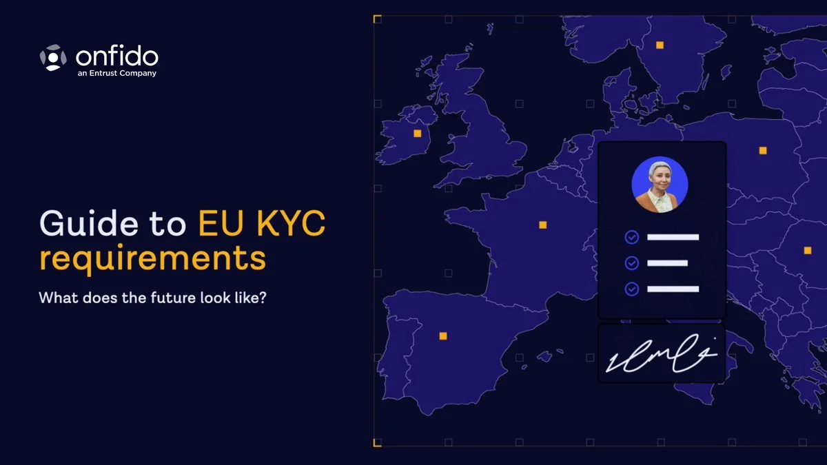
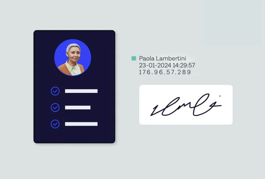
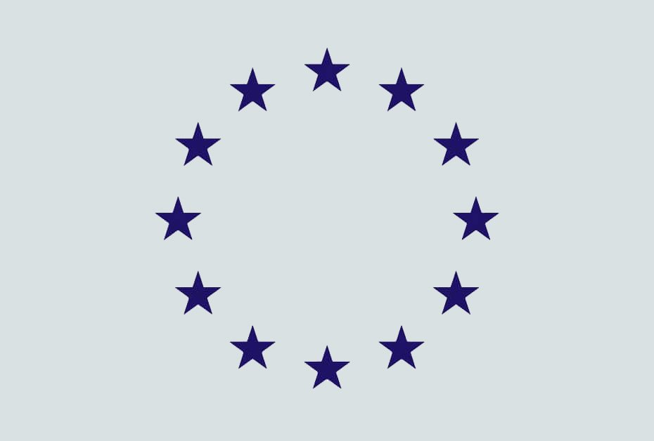
For the EU KYC Requirements piece, I developed a visual language that balanced clarity with a sense of authority. The design uses a dark, minimal palette inspired by European regulatory materials, paired with Onfido’s signature colours to maintain brand recognition. Maps, stars and simple geometric markers were used sparingly to reference the EU without overwhelming the content, helping ground the piece in its regional context. The identity card motifs and clean verification icons reinforced the theme of trust and compliance, while keeping the layouts approachable and easy to navigate. The outcome was a visual system that felt formal enough for regulatory subject matter, yet modern and user-friendly in the way Onfido communicates.
EU KYC Requirements